社区微信群开通啦,扫一扫抢先加入社区官方微信群

社区微信群
学习链接:
Python实战:抓肺炎疫情实时数据,画2019-nCoV疫情地图
Python实战:抓取肺炎疫情实时数据,画2019-nCoV疫情地图
参照以上两个链接实现了从腾讯新冠状病毒肺炎疫情实时追踪
学习链接内容中包含了如何爬取数据和如何实现数据爬取,不再赘述,现从实现过程中遇到的几个问题进行总结:
总的来说,pip是个好东西。
import time
import json
import requests
from datetime import datetime
import numpy as np
import matplotlib
import matplotlib.figure
from matplotlib.font_manager import FontProperties
from matplotlib.backends.backend_agg import FigureCanvasAgg
from matplotlib.patches import Polygon
from matplotlib.collections import PatchCollection
from mpl_toolkits.basemap import Basemap
import matplotlib.pyplot as plt
import matplotlib.dates as mdates
plt.rcParams['font.sans-serif'] = ['FangSong'] # 设置默认字体
plt.rcParams['axes.unicode_minus'] = False # 解决保存图像时'-'显示为方块的问题
def catch_daily():
"""抓取每日确诊和死亡数据"""
url = 'https://view.inews.qq.com/g2/getOnsInfo?name=wuwei_ww_cn_day_counts&callback=&_=%d'%int(time.time()*1000)
data = json.loads(requests.get(url=url).json()['data'])
data.sort(key=lambda x:x['date'])
date_list = list() # 日期
confirm_list = list() # 确诊
suspect_list = list() # 疑似
dead_list = list() # 死亡
heal_list = list() # 治愈
for item in data:
month, day = item['date'].split('/')
date_list.append(datetime.strptime('2020-%s-%s'%(month, day), '%Y-%m-%d'))
confirm_list.append(int(item['confirm']))
suspect_list.append(int(item['suspect']))
dead_list.append(int(item['dead']))
heal_list.append(int(item['heal']))
return date_list, confirm_list, suspect_list, dead_list, heal_list
def catch_distribution():
"""抓取行政区域确诊分布数据"""
data1 = {}
url='https://view.inews.qq.com/g2/getOnsInfo?name=disease_h5&&callback=&_=%d'%int(time.time()*1000)
data = json.loads(requests.get(url=url).json()['data'])
lis=[]
for m in range(len(data['areaTree'][0]['children'])):
for n in range(len(data['areaTree'][0]['children'][m]['children'])):
info={}
info['country']=data['areaTree'][0]['name']#国家
info['pronvice']=data['areaTree'][0]['children'][m]['name']#省份
info['city']=data['areaTree'][0]['children'][m]['children'][n]['name']#城市 len(data['areaTree'][0]['children'][0]['children'])
info['total_confirm']=data['areaTree'][0]['children'][m]['children'][n]['total']['confirm']
info['total_suspect']=data['areaTree'][0]['children'][m]['children'][n]['total']['suspect']
info['total_dead']=data['areaTree'][0]['children'][m]['children'][n]['total']['dead']
info['total_heal']=data['areaTree'][0]['children'][m]['children'][n]['total']['heal']
info['today_confirm']=data['areaTree'][0]['children'][m]['children'][n]['today']['confirm']
info['today_suspect']=data['areaTree'][0]['children'][m]['children'][n]['today']['suspect']
info['today_dead']=data['areaTree'][0]['children'][m]['children'][n]['today']['dead']
info['today_heal']=data['areaTree'][0]['children'][m]['children'][n]['today']['heal']
lis.append(info)
for item in lis:
if item['pronvice'] not in data1:
data1.update({item['pronvice']:0})
data1[item['pronvice']] += int(item['total_confirm'])
return data1
def plot_daily():
"""绘制每日确诊和死亡数据"""
date_list, confirm_list, suspect_list, dead_list, heal_list = catch_daily() # 获取数据
plt.figure('2019-nCoV疫情统计图表', facecolor='#f4f4f4', figsize=(10, 8))
plt.title('2019-nCoV疫情曲线', fontsize=20)
plt.plot(date_list, confirm_list, label='确诊')
plt.plot(date_list, suspect_list, label='疑似')
plt.plot(date_list, dead_list, label='死亡')
plt.plot(date_list, heal_list, label='治愈')
plt.gca().xaxis.set_major_formatter(mdates.DateFormatter('%m-%d')) # 格式化时间轴标注
plt.gcf().autofmt_xdate() # 优化标注(自动倾斜)
plt.grid(linestyle=':') # 显示网格
plt.legend(loc='best') # 显示图例
#plt.savefig('2019-nCoV疫情曲线.png') # 保存为文件
plt.show()
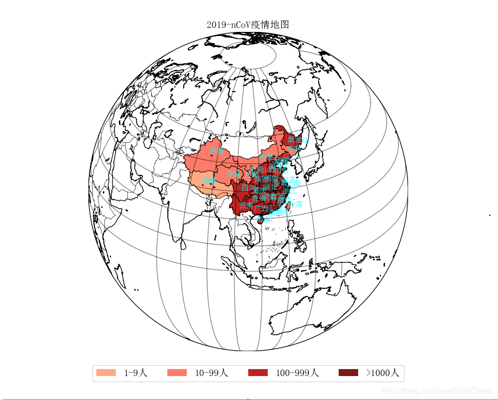
def plot_distribution():
"""绘制行政区域确诊分布数据"""
data = catch_distribution()
font = FontProperties(fname='china-shapefiles/simsun.ttf', size=14)
font_11 = FontProperties(fname='china-shapefiles/simsun.ttf', size=11)
lat_min = 0
lat_max = 60
lon_min = 70
lon_max = 140
handles = [
matplotlib.patches.Patch(color='#ffaa85', alpha=1, linewidth=0),
matplotlib.patches.Patch(color='#ff7b69', alpha=1, linewidth=0),
matplotlib.patches.Patch(color='#bf2121', alpha=1, linewidth=0),
matplotlib.patches.Patch(color='#7f1818', alpha=1, linewidth=0),
]
labels = [ '1-9人', '10-99人', '100-999人', '>1000人']
provincePos = {
"辽宁省":[121.7,40.9],
"吉林省":[124.5,43.5],
"黑龙江省":[125.6,46.5],
"北京市":[116.0,39.9],
"天津市":[117.0,38.7],
"内蒙古自治区":[110.0,41.5],
"宁夏回族自治区":[105.2,37.0],
"山西省":[111.0,37.0],
"河北省":[114.0,37.8],
"山东省":[116.5,36.0],
"河南省":[111.8,33.5],
"陕西省":[107.5,33.5],
"湖北省":[111.0,30.5],
"江苏省":[119.2,32.5],
"安徽省":[115.5,31.8],
"上海市":[121.0,31.0],
"湖南省":[110.3,27.0],
"江西省":[114.0,27.0],
"浙江省":[118.8,28.5],
"福建省":[116.2,25.5],
"广东省":[113.2,23.1],
"台湾省":[120.5,23.5],
"海南省":[108.0,19.0],
"广西壮族自治区":[107.3,23.0],
"重庆市":[106.5,29.5],
"云南省":[101.0,24.0],
"贵州省":[106.0,26.5],
"四川省":[102.0,30.5],
"甘肃省":[103.0,35.0],
"青海省":[95.0,35.0],
"新疆维吾尔自治区":[85.5,42.5],
"西藏自治区":[85.0,31.5],
"香港特别行政区":[115.1,21.2],
"澳门特别行政区":[112.5,21.2]
}
fig = matplotlib.figure.Figure()
fig.set_size_inches(10, 8) # 设置绘图板尺寸
axes = fig.add_axes((0.1, 0.12, 0.8, 0.8)) # rect = l,b,w,h
#圆柱投影
#m = Basemap(llcrnrlon=lon_min, urcrnrlon=lon_max, llcrnrlat=lat_min, urcrnrlat=lat_max, resolution='l', ax=axes)
#兰勃脱等角投影
#m = Basemap(projection='lcc', width=5000000, height=5000000, lat_0=36, lon_0=102, resolution='l', ax=axes)
#正射投影
m = Basemap(projection='ortho', lat_0=30, lon_0=105, resolution='l', ax=axes)
m.readshapefile('./china-shapefiles/china', 'province', drawbounds=True)
m.readshapefile('./china-shapefiles/china_nine_dotted_line', 'section', drawbounds=True)
m.drawcoastlines(color='black') # 洲际线
m.drawcountries(color='black') # 国界线
m.drawparallels(np.arange(lat_min,lat_max,10), labels=[1,0,0,0]) #画经度线
m.drawmeridians(np.arange(lon_min,lon_max,10), labels=[0,0,0,1]) #画纬度线
pset=set()
for info, shape in zip(m.province_info, m.province):
pname = info['OWNER'].strip('x00')
fcname = info['FCNAME'].strip('x00')
if pname != fcname: # 不绘制海岛
continue
for key in data.keys():
if key in pname:
if data[key] == 0:
color = '#f0f0f0'
poly = Polygon(shape, facecolor=color, edgecolor=color)
axes.add_patch(poly)
elif data[key] < 10:
color = '#ffaa85'
poly = Polygon(shape, facecolor=color, edgecolor=color)
axes.add_patch(poly)
elif data[key] <100:
color = '#ff7b69'
poly = Polygon(shape, facecolor=color, edgecolor=color)
axes.add_patch(poly)
elif data[key] < 1000:
color = '#bf2121'
poly = Polygon(shape, facecolor=color, edgecolor=color)
axes.add_patch(poly)
else:
color = '#7f1818'
poly = Polygon(shape, facecolor=color, edgecolor=color)
axes.add_patch(poly)
break
pos=provincePos[pname]
text=pname.replace('自治区','').replace('特别行政区','').replace('壮族','').replace('维吾尔','').replace('回族','').replace("省", "").replace("市", "")
if text not in pset:
x,y=m(pos[0],pos[1])
axes.text(x,y,text,fontproperties=font_11,color='#00FFFF')
pset.add(text)
axes.legend(handles, labels, bbox_to_anchor=(0.5, -0.11), loc='lower center', ncol=4, prop=font)
axes.set_title("2019-nCoV疫情地图", fontproperties=font)
FigureCanvasAgg(fig)
fig.savefig('2019-nCoV疫情地图.png')
fig.set_visible(b=True)
if __name__ == '__main__':
plot_daily()
plot_distribution()
代码内容源自于以上两个学习连接中代码的整合,以上代码段实现了折线图的显示和地图的下载。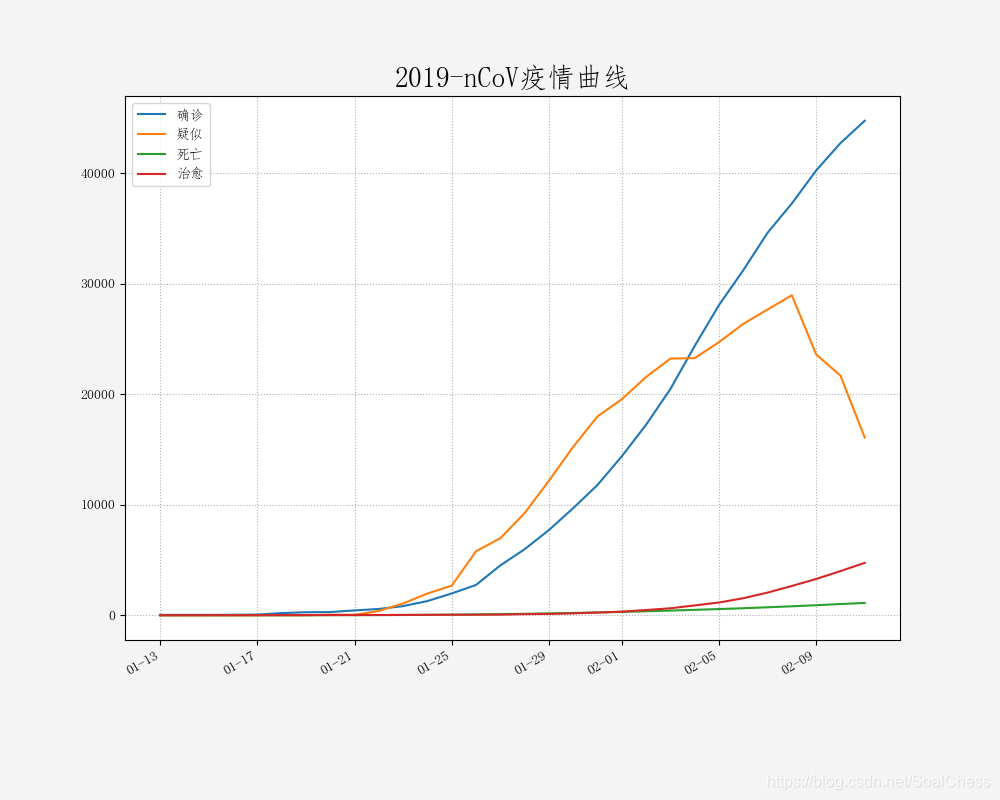
如果觉得我的文章对您有用,请随意打赏。你的支持将鼓励我继续创作!
