社区微信群开通啦,扫一扫抢先加入社区官方微信群

社区微信群
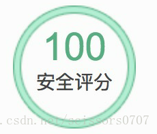
一个用来展示评分信息带内外边框的圆环,如下图:
###二、实现思路(心路历程)
当我看到这个圆环的时候,第一种想法就是可以用两个只具有边框的圆进行覆盖生成,但当时没想清楚,用了一对父子关系的div进行实现,却如何也实现不了。因为内层的div(圆)无法将其边框放置在外层div(圆)的边框之中,在实际页面中就是无法对齐。第二种想法则是yc想出来,用一对父子关系的div进行垂直水平居中之后,分别设置其边框背景来实现。第三种想法也是yc想出来的。虽然和第二种想法很像,但是也是另外一种实现方法,通过父子div的父div只设置边框,子div设置边框和阴影来实现。最后总结出三种实现方式。
三种实现方法:
<!DOCTYPE html>
<html lang="en">
<head>
  <meta charset="UTF-8">
  <title>Document</title>
  <style>
    .circle{
		position: relative;
		box-sizing: border-box;
	}
	.big{
		width: 140px;
		height: 140px;
		border: 7px solid #69BBC6;
		border-radius:50% ;
		position: absolute;
		margin: auto;     /*以下五个属性为水平垂直居中的方法*/
		left: 0;
		top: 0;
		right: 0;
		bottom: 0;
		box-sizing: border-box;
	}
	.small{
		width: 136px;
		height: 136px;
		border: 3px solid #9DDBE8;
		border-radius: 50%;
		position: absolute;
		margin: auto;     /*以下五个属性为水平垂直居中的方法*/
		left: 0;
		top: 0;
		right: 0;
		bottom: 0;
		box-sizing: border-box;
	}
</style>
</head>
<body>
	<div class="circle">
		<div class="big"></div>
		<div class="small"></div>
	</div>
</body>
</html>
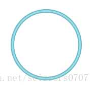
效果展示:
2. 一对父子关系的div进行实现,具体通过子div设置边框和白色背景并置于父div上方,父div设置和子div相同颜色的边框和不一样的背景。
<!DOCTYPE html>
<html lang="en">
<head>
<meta charset="UTF-8">
<title>Document</title>
<style>
.circle{
box-sizing: border-box;
}
.out{
position: relative;
width:136px;
height: 136px;
border-radius: 50%;
border: 2px solid #c95e63;
background: #e99e98;
}
.in{
position: absolute;
z-index: 5;
width:126px;
height: 126px;
border-radius: 50%;
border: 2px solid #c95e63;
background-color: #fff;
text-align: center;
margin: auto; /*以下五个属性为水平垂直居中的方法*/
left: 0;
top: 0;
right: 0;
bottom: 0;
}
.grade_num {
font-size: 36px;
color: #c95e63;
line-height: 1px;
}
.grade_show_text {
font-size:20px;
}
</style>
</head>
<body>
<div class="circle out">
<div class="circle in">
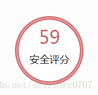
<p class="grade_num">59</p>
<p class="grade_show_text">安全评分</p>
</div>
</div>
</body>
</html>
效果展示:
3. 此方法与第二种类似,仍是利用父子div进行实现,区别在于此方法父div只需设置边框,而子div需设置边框、阴影,无需设置白色背景。
<!DOCTYPE html>
<html lang="en">
<head>
  <meta charset="UTF-8">
  <title>Document</title>
  <style>
	.out{
		width: 136px;
		height: 136px;
		border: 2px solid #69BBC6;
		border-radius: 50%;
		position: relative;
	}
	.in{
		width: 126px;
		height: 126px;
		border: 2px solid #69BBC6;
		border-radius: 50%;
		position: absolute;
		margin: auto;      /*以下五个属性为水平垂直居中的方法*/
		left: 0;
		right: 0;
		top: 0;
		bottom: 0;
		box-shadow:0 0 0 10px #9DDBE8;
	}
</style>
</head>
<body>
	<div class="out">
		<div class="in"></div>
	</div>
</body>
</html>
效果展示:
遇到需求,先有实现的思路。在实现自己的思路过程中,遇到问题冷静思考问题出在哪里,耐心解决。在一种方式解决问题后,继续深思还有什么其它的方法来解决问题,哪怕这种方法没有之前的更好。
如果觉得我的文章对您有用,请随意打赏。你的支持将鼓励我继续创作!