社区微信群开通啦,扫一扫抢先加入社区官方微信群

社区微信群
环境:pyecharts库,echarts-countries-pypkg,echarts-china-provinces-pypkg,echarts-china-cities-pypkg
数据:2018年4月16号的全国各地最高最低和天气类型的数据——2018-4-16.json(爬虫爬的)
代码:天气数据爬虫代码,图表绘制代码 代码地址:https://github.com/goodloving/pyecharts.git(py文件)
一、公共属性
1、标题栏的属性:一般在实例化(初始化)类型时给与,如bar = Bar(“大标题”,“副标题”,···各种属性···)
title_color = “颜色”:标题颜色,可以是‘red’或者‘#0000’
title_pos = ‘位置’:标题位置,如‘center’,‘left’···
width = 1200:图表的宽
height = 800:图表的高
background_color = "颜色":图表的背景色
·····
2、标签栏的属性:如bar.add(“标签”,x,values,···属性···)
'mark_'类,通个'mark_'显示,如 mark_point['max', 'min', 'average']:标出最大最小和平均值的点,
mark_point_textcolor,mark_line_symbolsize·····
'legend_'类,如legend_pos=‘left’:标签的位置
'is_'类,如is_label_show=True:显示每个点的值,is_datazoom_show=True:实现移动控制x轴的数量
is_convert = True:x,y轴是否调换
eg:
bar = pyecharts.Bar("全国各地最高气温", "2018-4-18", title_color='red', title_pos='right', width=1400, height=700, background_color='#404a59')
bar.add("最高气温", cities, highs, mark_point=['max', 'min', 'average'], is_label_show=True, is_datazoom_show=True, legend_pos='left')
bar.render('Bar-High.html')
3、Geo,Map无法显示底图
pyecharts v0.3.2以后,pyecharts 将不再自带地图 js 文件。如用户需要用到地图图表,可自行安装对应的地图文件包。
地图文件被分成了三个 Python 包,分别为:
全球国家地图: echarts-countries-pypkg (1.9MB)
中国省级地图: echarts-china-provinces-pypkg (730KB)
中国市级地图: echarts-china-cities-pypkg (3.8MB)
(1)pycharm直接在设置里面搜索安装这三个库
(2)pip安装
pip install echarts-countries-pypkg
pip install echarts-china-provinces-pypkg
pip install echarts-china-cities-pypkg
二、各种图表
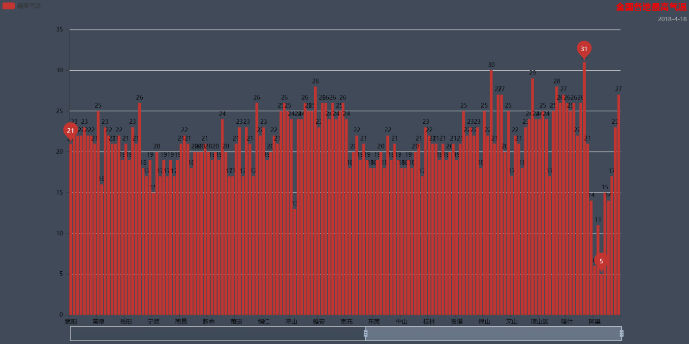
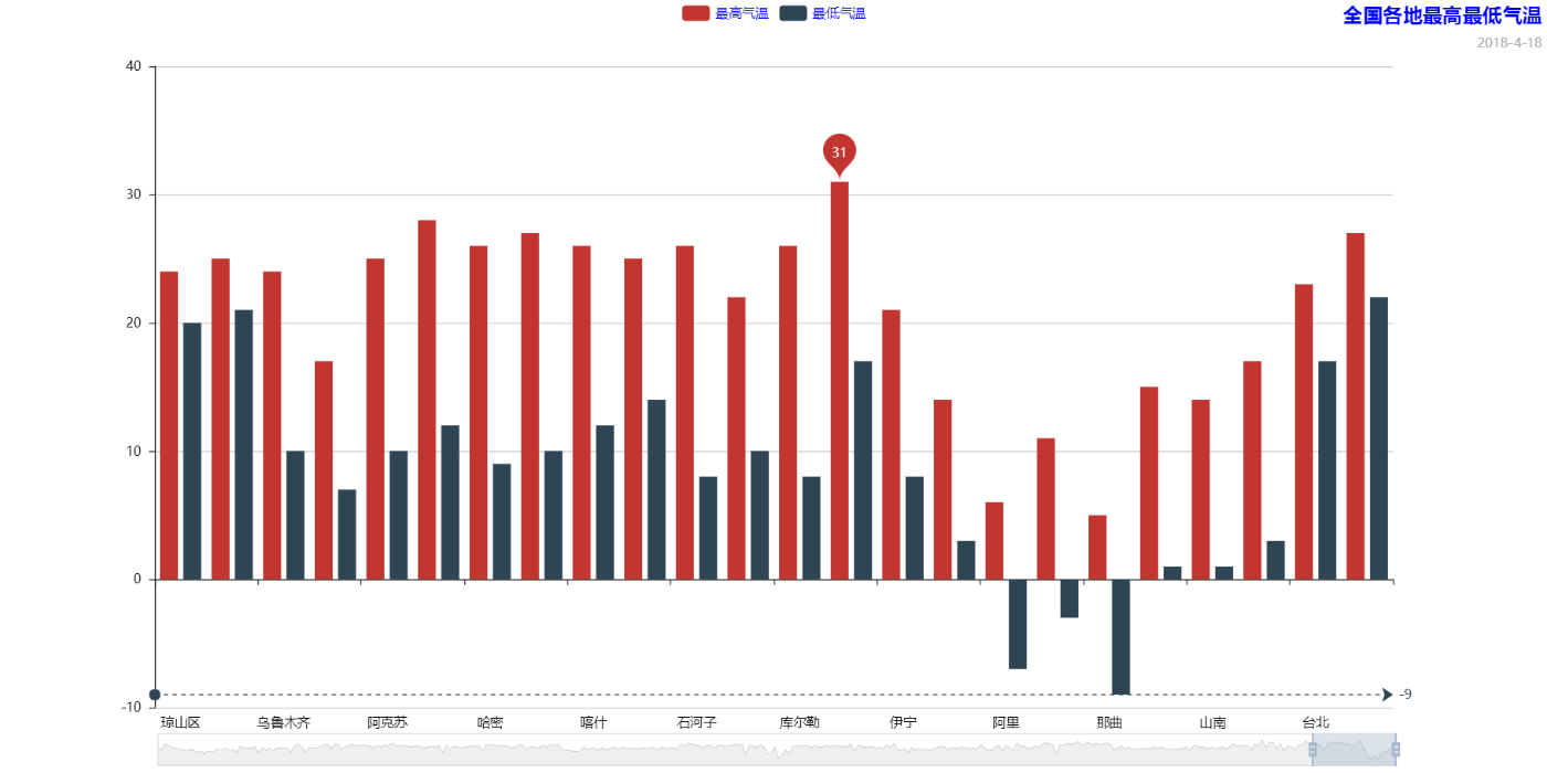
1.柱状图/条形图——Bar
bar = pyecharts.Bar("全国各地最高最低气温", "2018-4-18", title_pos='right', title_color='blue', width=1400, height=700,background_color='white')
bar.add("最高气温", cities, highs, mark_point=['max'], legend_text_color='red', is_datazoom_show=True)
bar.add("最低气温", cities, lows, mark_line=['min'], legend_text_color='blue' )
bar.render('Bar-High-Low.html')
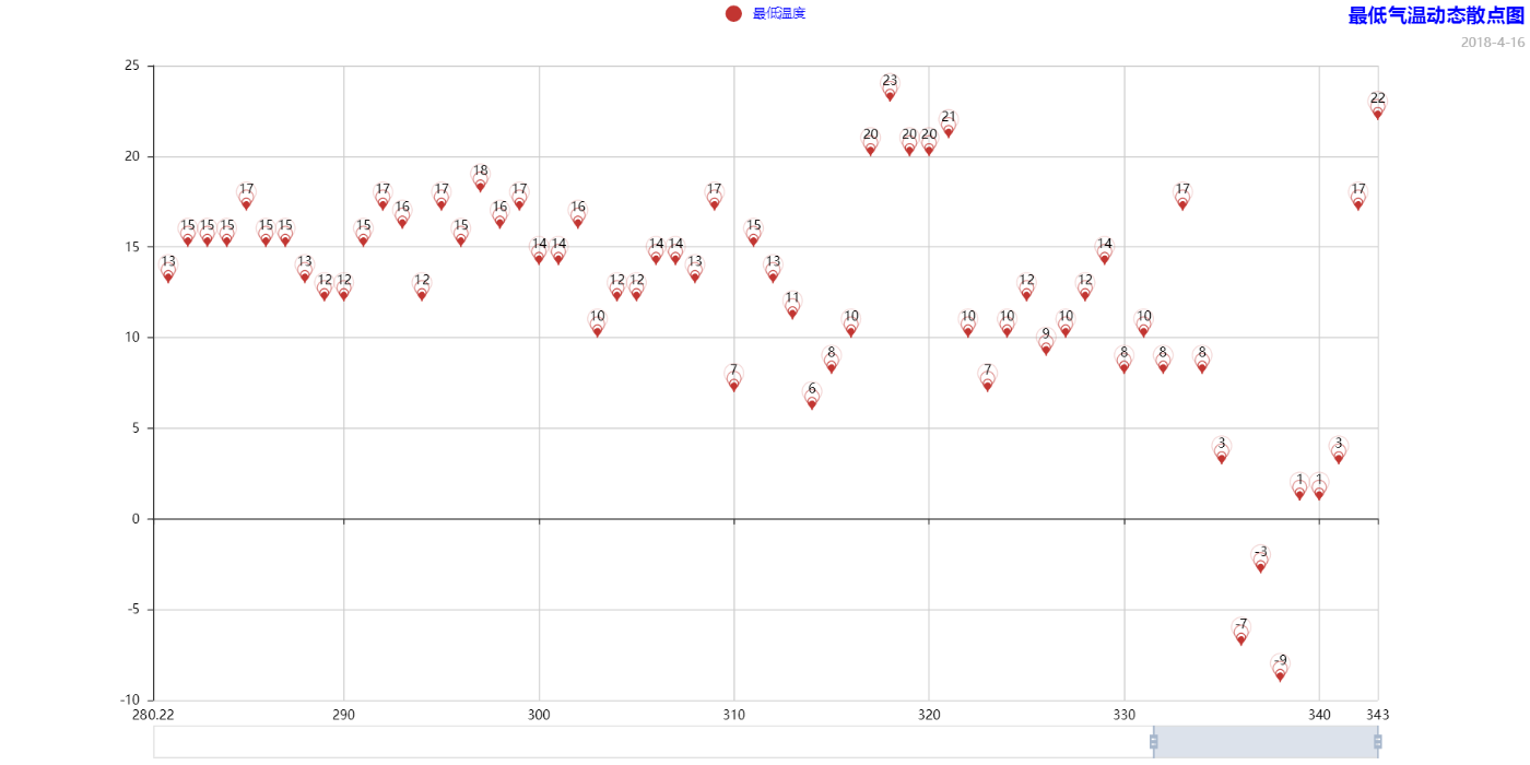
2、散点图——EffectScatter
es = pyecharts.EffectScatter("最低气温动态散点图", "2018-4-16", title_pos='right', title_color='blue', width=1400, height=700, background_color='white')
es.add("最低温度", range(0, len(cities)), lows, legend_pos='center', legend_text_color='blue',symbol_size=10, effect_period=3, effect_scale=3.5, symbol='pin',is_datazoom_show=True,is_label_show=True)
es.render("EffectScatter-low.html")
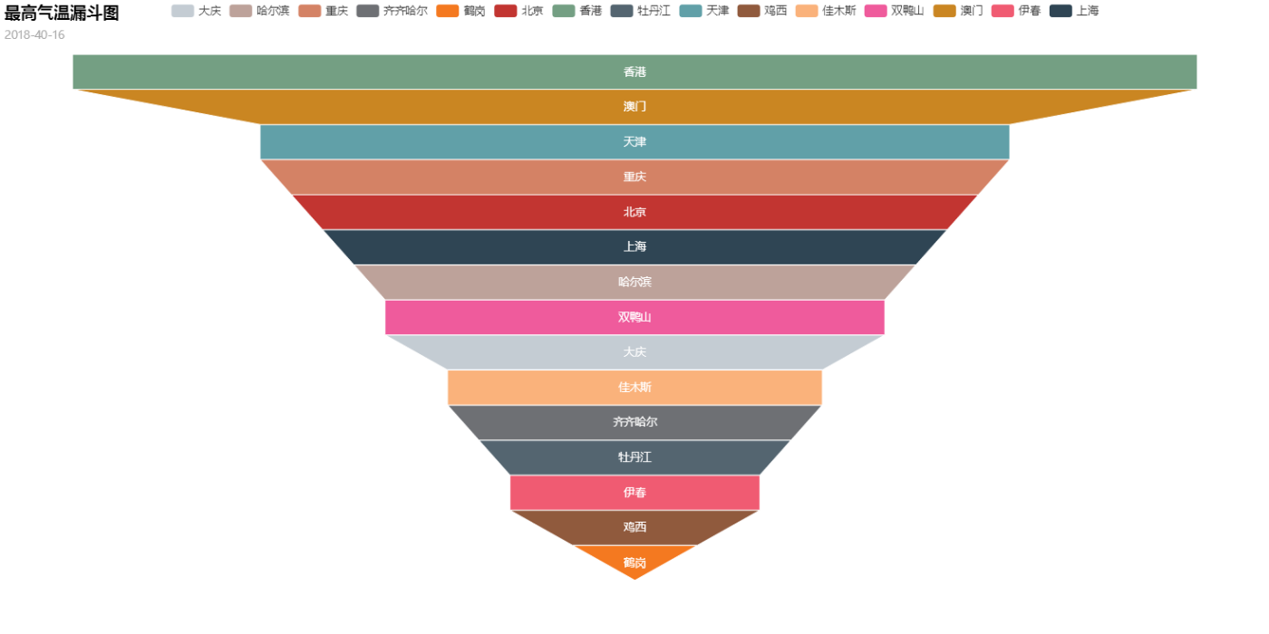
3、漏斗与——Funnel
fl = pyecharts.Funnel("最高气温漏斗图", "2018-40-16", title_pos='left', width=1400, height=700)
fl.add("最低气温", cities[:15], lows[:15], is_label_show=True, label_pos='inside', label_text_color='white')
fl.render("Funnel-low.html")
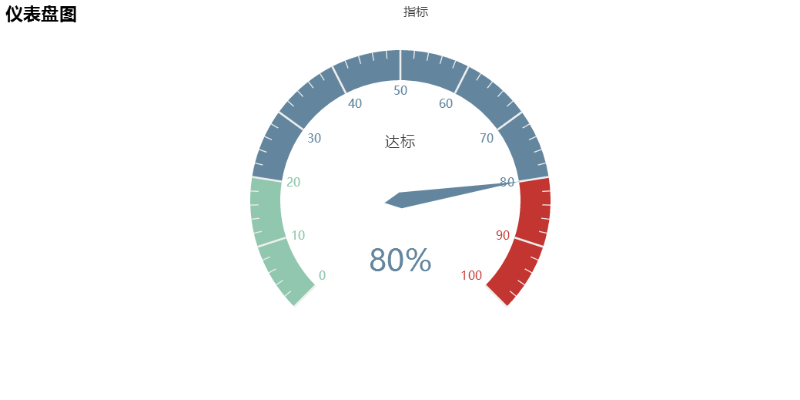
4、仪表盘——Guage
gu = pyecharts.Gauge("仪表盘图")
gu.add("指标", "达标", 80)
gu.render("Guage-eg.html")
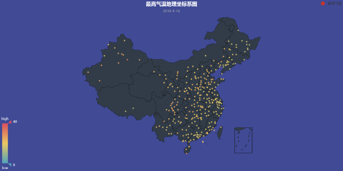
5、地理坐标图——Geo
geo = pyecharts.Geo("最高气温地理坐标系图", '2018-4-16', title_color='#fff', title_pos='center', width=1200, height=600, background_color='#404a95')
geo.add("最高气温", cities, highs, is_visualmap=True, visual_range=[0, 40], visual_text_color='#fff', symbol_size=5, legend_pos='right',is_geo_effect_show=True)
geo.render("Geo-Low.html")
6、关系图——Graph(略)
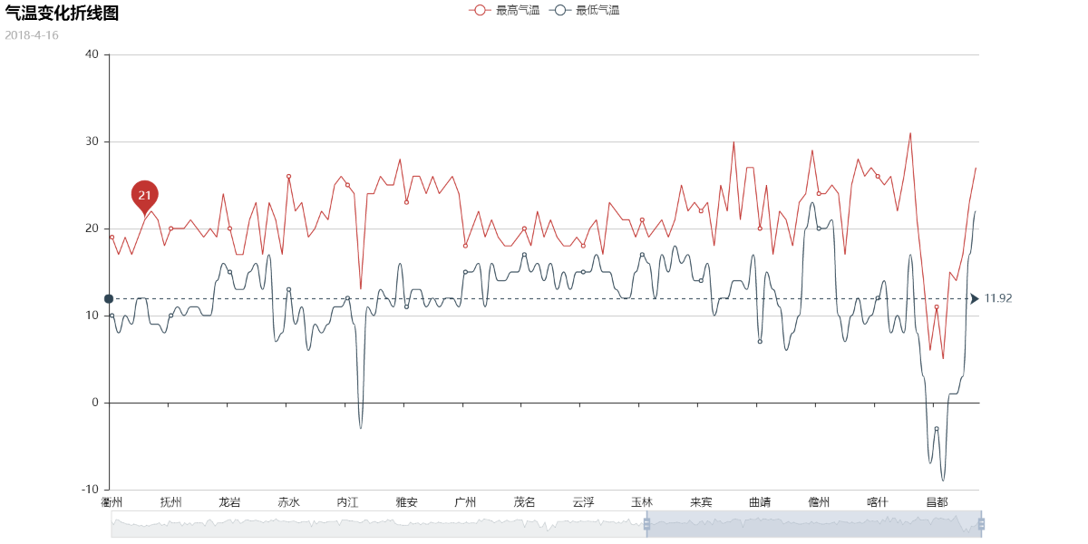
7、折线/面积图——Line
line = pyecharts.Line("气温变化折线图", '2018-4-16', width=1200, height=600)
line.add("最高气温", cities, highs, mark_point=['average'], is_datazoom_show=True)
line.add("最低气温", cities, lows, mark_line=['average'], is_smooth=True)
line.render('Line-High-Low.html')
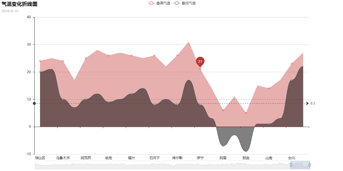
line = pyecharts.Line("气温变化折线图", '2018-4-16', width=1200, height=600)
line.add("最高气温", cities, highs, mark_point=['average'], is_datazoom_show=True, is_fill=True, line_opacity=0.2, area_opacity=0.4)
line.add("最低气温", cities, lows, mark_line=['average'], is_smooth=True, is_fill=True, area_color="#000", area_opacity=0.5)
line.render('Area-High-Low.html')
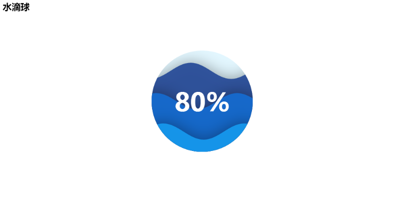
8、水滴球——Liquid
lq = pyecharts.Liquid("水滴球")
lq.add("Liquid", [0.8, 0.5, 0.2], is_liquid_outline_show=False, is_liquid_animation=True)
lq.render("LiQuid.html")
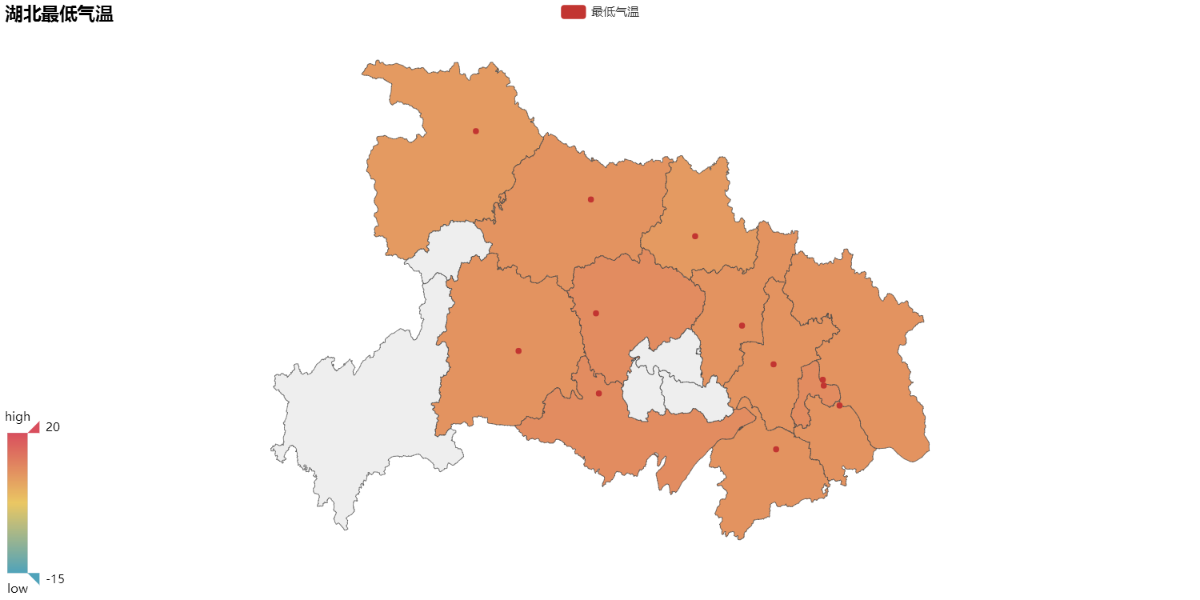
9、地图——Map
a_city = []
for i in cities:
a_city.append(i + '市')
map = pyecharts.Map("湖北最低气温", width=1200, height=600)
map.add("最低气温", a_city, lows, maptype='湖北', is_visualmap=True, visual_text_color='#000', visual_range= [-15, 20])
map.render("Map-low.html")
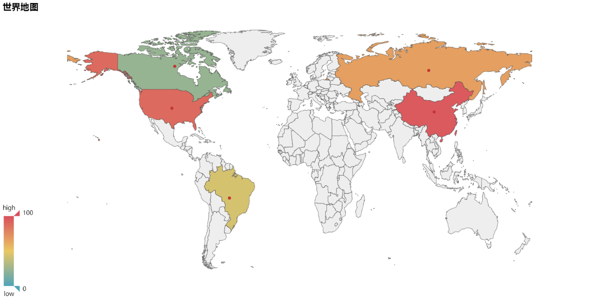
value = [95.1, 23.2, 43.3, 66.4, 88.5]
attr= ["China", "Canada", "Brazil", "Russia", "United States"]
map = Map("世界地图示例", width=1200, height=600)
map.add("", attr, value, maptype="world", is_visualmap=True, visual_text_color='#000')
map.render('Map-World.html')
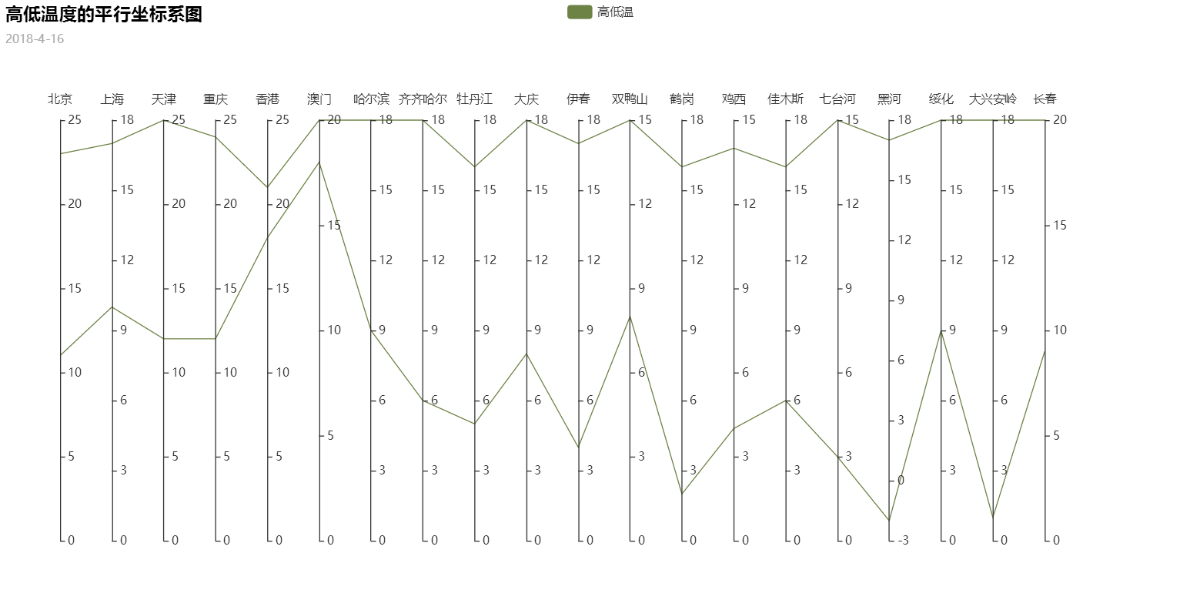
10、平行坐标图——Parallel
parallel = pyecharts.Parallel("高低温度的平行坐标系图", '2018-4-16', width=1200, height=600)
parallel.config(cities[:20])
parallel.add("高低温", [highs[:20], lows[:20]], is_random=True)
parallel.render('Parallel-High-Low.html')
11、饼图——Pie
sun = 0
cloud = 0
lit_rain = 0
mit_rain = 0
sail = 0
shadom = 0
z_rain = 0
th_rain = 0
for i in types:
if i == '晴':
sun += 1
elif i == '多云':
cloud += 1
elif i == '小雨':
lit_rain += 1
elif i == '中雨':
mit_rain += 1
elif i == '阴':
shadom += 1
elif i == '阵雨':
z_rain += 1
elif i == '雷阵雨':
th_rain += 1
elif i == '扬沙':
sail += 1
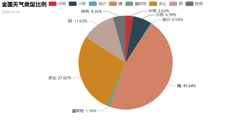
pie = pyecharts.Pie("全国天气类型比例", '2018-4-16')
pie.add('天气类型', weather, [mit_rain, lit_rain, sail, sun, th_rain, cloud, shadom, z_rain], is_label_show=True)
pie.render('Pie-weather.html')
修改:pie = pyecharts.Pie("全国天气类型比例", '2018-4-16', title_pos='center')
pie.add('天气类型', weather, [mit_rain, lit_rain, sail, sun, th_rain, cloud, shadom, z_rain], is_label_show=True, legend_pos='left', label_text_color=None, legend_orient='vertical', radius=[30, 75])
pie.render('Pie-weather.html')
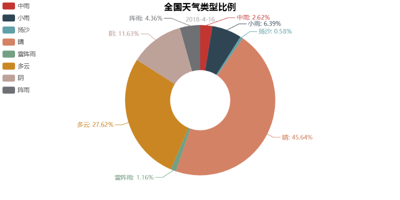
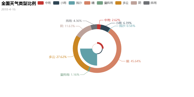
pie镶嵌:
center -> list
饼图的中心(圆心)坐标,数组的第一项是横坐标,第二项是纵坐标,默认为 [50, 50]默认设置成百分比,设置成百分比时第一项是相对于容器宽度,第二项是相对于容器高度
rosetype -> str
是否展示成南丁格尔图,通过半径区分数据大小,有'radius'和'area'两种模式。默认为'radius'radius:扇区圆心角展现数据的百分比,半径展现数据的大小area:所有扇区圆心角相同,仅通过半径展现数据大小
pie = pyecharts.Pie("全国天气类型比例", '2018-4-16')
pie.add('', weather, [mit_rain, lit_rain, sail, sun, th_rain, cloud, shadom, z_rain], is_label_show=True, label_text_color=None, legend_orient='vertical', radius=[40, 50], center=[50, 50])
pie.add('', ['中雨', '小雨', '扬沙', '晴'], [lit_rain, mit_rain, sun, sail], radius=[10, 35], center=[50, 50], rosetype='area')
pie.render('Pie-weather.html')
至此,pyecharts的大多数图标的绘制我们都可以实现了,更多知识可以查看下面链接
如果觉得我的文章对您有用,请随意打赏。你的支持将鼓励我继续创作!